Contrast Checker – WCAG 2.1
Extract exact hex colors from screenshots, compare foreground/background colors, and check WCAG 2.1 contrast.
View on Google Play →Accessibility tools, everyday calculators, planning utilities and simple apps designed to get you from “I need this” to done without unnecessary clutter.
Upload a screenshot or image, tap a color to extract its hex code, then compare color pairs for WCAG contrast. Built for designers, developers, UI/UX work and accessibility checks.
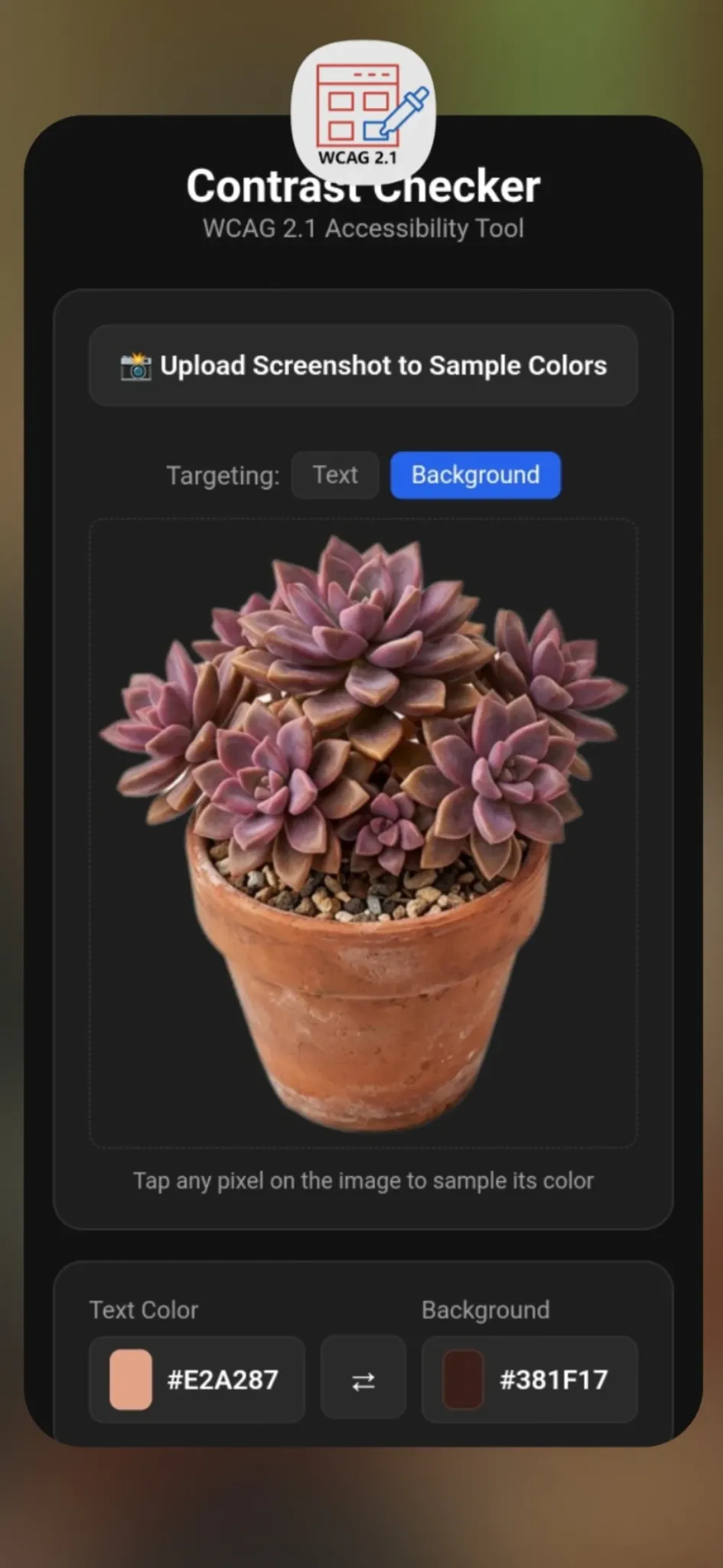
Extract exact hex colors from screenshots, compare foreground/background colors, and check WCAG 2.1 contrast.
View on Google Play →Swipe through meal ideas, discover dishes, and save favorites when you cannot decide what to eat.
View on Google Play →A lightweight source of motivational and inspirational quotes for quick daily encouragement.
View on Google Play →Calculate BMI quickly with standard or metric measurements and a clear category reference.
View on Google Play →Enter a price and tax rate to instantly calculate sales tax and the final total.
View on Google Play →Manage event-rental bookings, availability, inventory, reminders, and pricing in one place.
View on Google Play →Split restaurant bills proportionally, including tax, flat fees, and custom tips.
View on Google Play →Turn your phone into a simple box-fan white-noise machine for sleep, focus, or background sound.
View on Google Play →A pillbox-inspired Android app for keeping medication organization simple and visually familiar.
View on Google Play →Save your parked car location with one tap, add garage notes and offline photos, then open walking directions back to your vehicle.
View on Google Play →Short practical answers for common design and accessibility questions.
Grab an exact color value from any screenshot or image.
A plain-English guide to common WCAG contrast thresholds.
A practical workflow for readable foreground/background color pairs.
Sample exact colors from photos, graphics, mockups and inspiration images.
A practical explanation of WCAG contrast levels and what changes between them.
Review text, buttons and UI colors before you publish.
A cleaner way to divide the real total instead of just the menu subtotal.
Separate personal items from shared costs without awkward math.
Turn decision fatigue into a quick shortlist and pick something.